A website can look impressive in a portfolio thumbnail and fall apart halfway down the page. When you're choosing a design for your agency, inspect the hero, a middle section and the footer. Then do the same on a phone.
Below are four insurance agency websites we designed. Each takes a different approach to imagery and composition. The screenshots show the actual delivered sites; this review explains the design, rather than claiming traffic or sales results we haven't measured.
Holestin Insurance: make a local agency recognizable
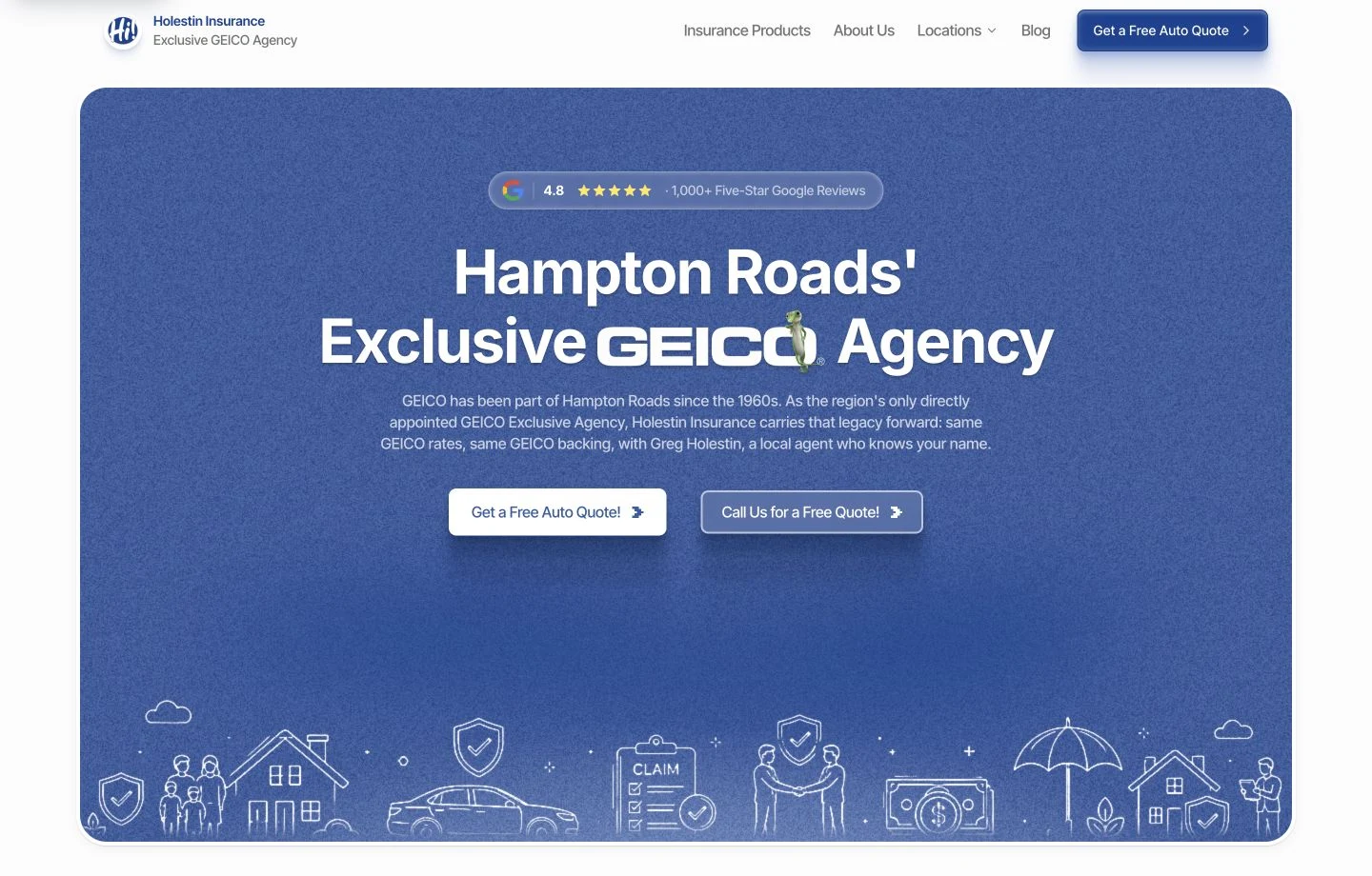
Holestin Insurance serves Hampton and Virginia Beach, Virginia. Its blue hero combines a broad textured panel, centered type and fine line illustrations. The deliberate spacing gives the office a presence of its own. The agency identity remains visible rather than becoming a small label inside a generic coverage directory.
The useful design lesson is hierarchy. A visitor should be able to distinguish the agency name, the main message and the next action without reading every navigation item. The texture and illustrations give the page character, while the contact controls still need to remain clear on a narrow screen.
For an agency with two offices, the closing section matters as much as the hero. Review whether a visitor can identify the appropriate office and reach it. A handsome homepage with ambiguous phone routing leaves an important part of the job unfinished.
Anne Scharp Insurance: use one visual language
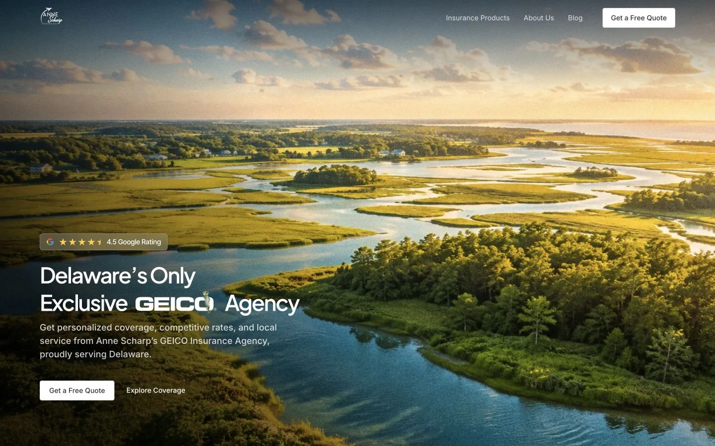
Anne Scharp Insurance is in Wilmington, Delaware. The design gives large landscape imagery room to breathe. The quieter type and spacing let the image establish the mood without forcing every part of the screen to compete for attention.
The same visual treatment carries into the middle and closing sections. That continuity is worth inspecting when you review a designer's work. A polished hero pasted above unrelated cards is less coherent than a page whose images, text widths and section spacing feel intentionally related.
On mobile, ask where the crop falls. A photograph that looks balanced across a desktop can lose its subject behind a heading or become an unhelpful strip on a phone. The mobile composition should be a considered version of the design, not merely a shrunken desktop screenshot.
Northern Shore Insurance: make the imagery belong to the place
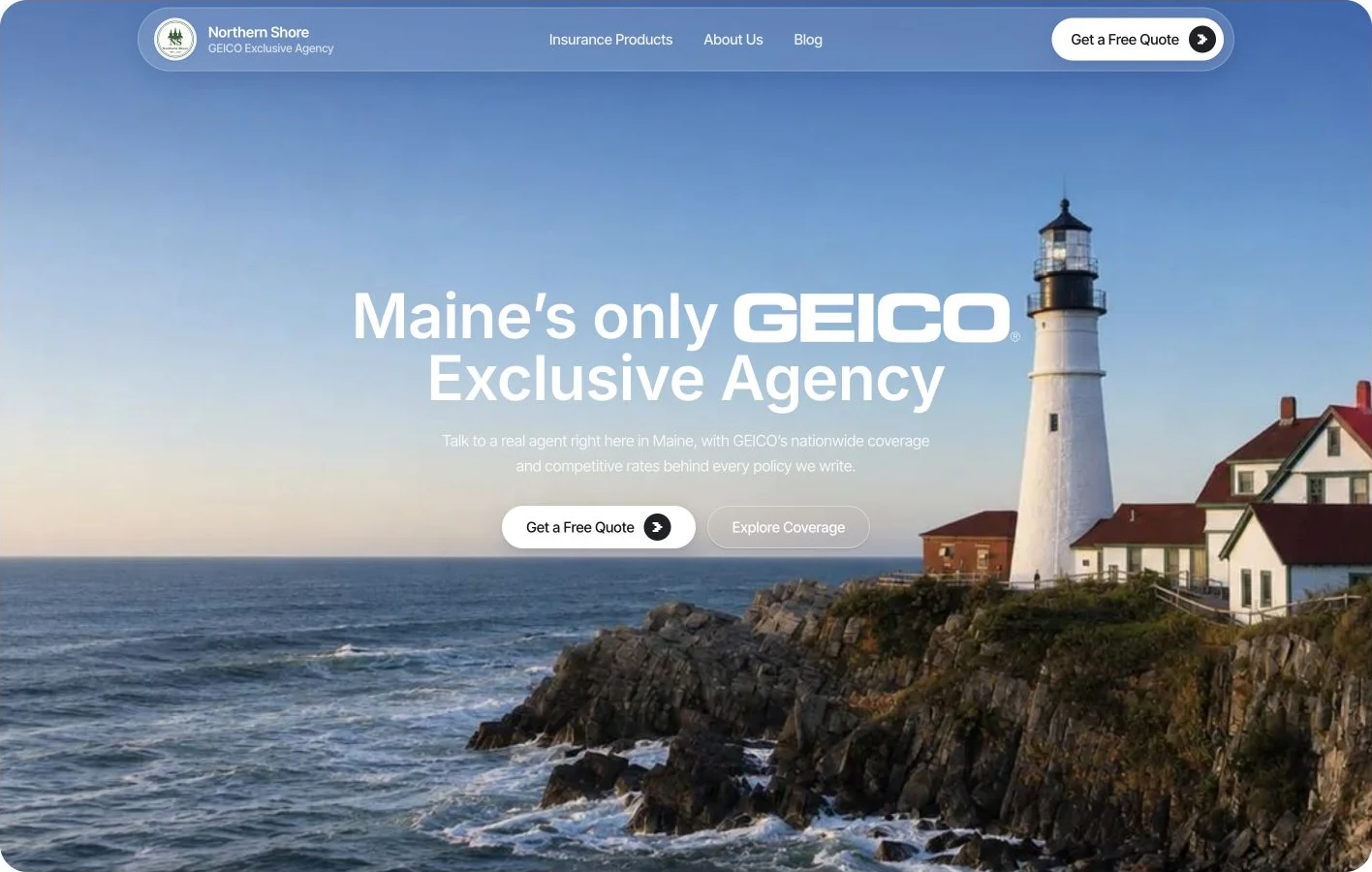
Northern Shore Insurance, Ashley Bullard's agency in Portland, Maine, uses a coastal visual direction. The opening scene, road imagery and harbor section give the page a consistent sense of place.
This is an alternative to filling an insurance site with disconnected stock photos of keys, handshakes and smiling families. The lesson is not that every agency needs scenic photography. It is that the images should share a purpose. An urban office, a rural community and a coastal agency may deserve different treatments.
Local scenery does not prove that an agency offers every product associated with that setting. Keep coverage descriptions separate and accurate. A photograph can establish atmosphere; licensed availability and carrier relationships require explicit, approved wording.
Coker Insurance: give the page a confident finish
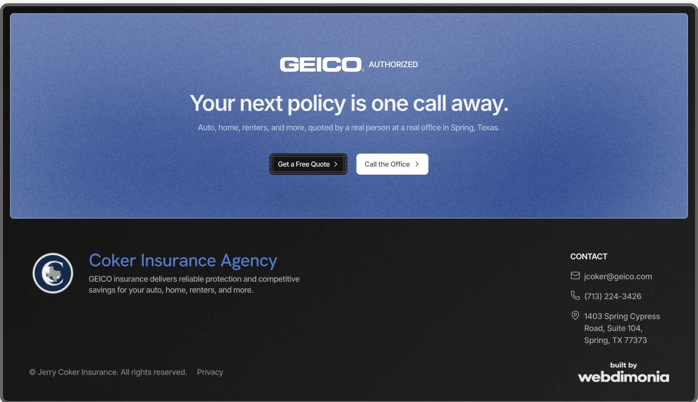
Jerry Coker's agency is in Spring, Texas. The closing panel repeats the blue texture and high-contrast buttons used in the opening, then leads into a dark footer with office contact details. That continuity gives the final section the same attention as the first screen.
When comparing examples, scroll all the way down. The final section is where a reader who has finished evaluating the agency needs a useful action. Contact information should remain legible, and the footer should help someone find the office rather than act as a decorative dead end.
The mobile version deserves the same scrutiny. Check the menu, image crop, text wrapping and contact controls. A portfolio's desktop image shows only one part of the delivered experience.
A five-minute review worksheet
| Inspect | Ask yourself |
|---|---|
| First screen | Can I identify the agency and its main next step? |
| Imagery | Do the images share a clear purpose and remain usable on mobile? |
| Middle sections | Does the design stay coherent after the hero? |
| Contact journey | Can I reach the right office without guessing? |
| Footer | Does the page end with useful information and a clear action? |
Save the specific section you like and explain why. “The landscape gives the headline space” is a more useful brief than “make it premium.” Combine that visual brief with the website buying checklist, so the finished site is both distinctive and usable.
If you want a similar level of custom design, explore our insurance agency website service. The starting build price is $2,000; final scope depends on the pages, content and functionality your agency needs.