Before booking a photographer, show them the places the images will go. A wide homepage hero needs a different composition from a team portrait or a narrow mobile section. A folder of attractive photos can still leave the designer without the right image.
For an insurance agency, give each photograph a job: introduce the people, make the office recognizable or establish a sense of place. Plan those jobs together so the site feels like one design.
Build a shot list around the actual pages
| Image | Intended use | What to capture |
|---|---|---|
| Main hero | Set the visual tone | A strong scene with room for the planned text |
| Team portrait | Introduce the office | Real staff, consistent lighting, natural spacing |
| Individual portraits | Identify contacts | Matching framing and sufficient crop flexibility |
| Office exterior | Help visitors recognize the location | Entrance and signage, with a clear approach |
| Interior detail | Show the customer experience | A real reception or meeting area, with private information removed |
| Local scene | Connect the page to its setting | A relevant place, without implying a false office or service |
Share the proposed page layout with the photographer. “We need space on the left for a headline” is more actionable than “shoot something wide.” If the design has not started, ask for several compositions rather than one tightly cropped final image.
Plan desktop and mobile as separate compositions
A desktop hero may show a broad landscape while the mobile version uses a narrower crop. Keep the important subject away from edges that will disappear. Photograph a few vertical options if the mobile design needs them.
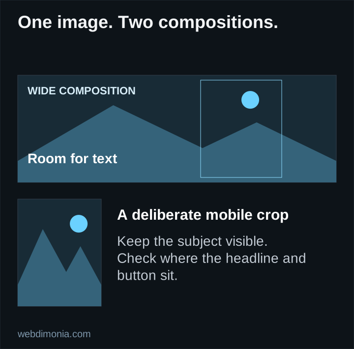
Avoid baking important text into the photograph. Real page text can wrap, scale and remain accessible. If the photo is too busy behind the headline, choose another crop, use a separate text area or apply a restrained overlay. Making the text tiny is not a good solution.
Review actual phone screens before approving the composition. Check faces, horizon lines, bright backgrounds and whether a button obscures the subject. The goal is a balanced page, not preserving every pixel of the desktop image.
Decide when a real photograph matters
Use genuine office and staff images when the image is meant to establish identity. A stock portrait should never be presented as an employee. A generated office should not be used as evidence of a real location.
Stock landscapes or licensed contextual images can support a visual direction when their role is clear. Check that the location and scene do not imply a business presence you do not have. Do not use a carrier logo, recognizable customer or private property image without the necessary permission or license.
For actual design references, compare Anne Scharp Insurance and Northern Shore Insurance. Both use large scenic imagery, but their compositions belong to different agency presentations. These are visual examples, not evidence that scenery causes a particular conversion rate.
Prepare the office for the shoot
Remove customer paperwork, policy details, whiteboard notes, account screens and personal information before the camera arrives. Check reflections in glass and monitors. Get the permissions required for anyone appearing in the published images.
Keep clothing and backgrounds coordinated without making every person look identical. Use the same portrait treatment for the team so new photographs can be added later. Record the basic setup, crop and background to make future updates easier.
Capture the entrance from the perspective of an arriving visitor. A beautifully framed building is less helpful if the actual doorway is out of view. Save a few straightforward practical images even if the main website uses a more expressive visual style.
Give every image a publishing plan
Ask for high-quality originals and optimized website versions. The site should serve appropriate sizes instead of downloading the largest original for every device. Keep enough resolution for the largest intended display, but do not equate a large file with better presentation.
Use descriptive file names and put meaningful images near relevant text. Google's image guidance explains how image context and accessible image elements help search understand a page.
Write alt text for the image's purpose in that context. “Agency team outside the Wilmington office” may be useful if it is accurate. Repeating a string of insurance keywords is not. Decorative images may need empty alt text; the W3C image tutorial explains the distinction.
Approve a contact sheet, then the page
First review the selected images together for consistency, accuracy and rights. Then approve them in the actual page compositions at desktop and mobile sizes. An excellent photograph can still be the wrong image for a particular section.
The final handoff should identify the chosen files, licenses, intended placements and any crop restrictions. Combine this with the website design brief. Your designer can then build a coherent public experience instead of improvising around whatever files arrive last.