“We put our customers first” could appear on almost any insurance agency website. It doesn't tell a visitor who will answer the phone or what it's like to contact your office.
An About page gets more useful when it names the people, explains their roles and gives the reader a clear next step. You don't need an elaborate origin story. You need details that belong to your agency.
Open with the agency as it exists today
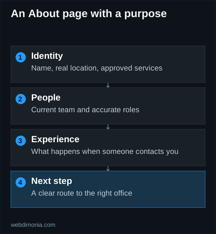
Introduce the agency name, real location and the people or team a customer can expect to contact. Explain the service in plain language. If the office represents a carrier, describe the relationship accurately and obtain any required approval for the wording and assets.
Avoid an opening such as “We are a premier, customer-centric agency committed to excellence.” It does not help the reader distinguish your office from another one. Replace it with facts the office can verify.
A fill-in starting point is: “[Agency name] helps [actual audience] with [approved services] from our office in [real location]. When you contact us, [accurate description of the next step].” Replace every bracket with an approved fact before publication. This is a writing pattern, not a statement about a particular agency.
Make people identifiable without overloading their biographies
Use names, accurate roles and consistent photographs where the team has agreed to publication. A useful biography can explain what the person helps with and how a visitor should reach the office. Include professional credentials only after checking the current wording and status.
Separate personal background from claims about the agency. An owner's years in a previous role are not automatically the agency's operating history. Do not combine several employees' years into a dramatic “combined experience” number without a clear, worthwhile reason and supporting records.
Keep personal details optional and relevant. A short local connection can make a biography warmer, but the customer should not have to read a life story before finding the contact button. Never use stock portraits as if they depict employees.
Explain what contacting the office feels like
Describe the real process: whether the first conversation is by phone, how online requests are assigned and when the office normally responds. Avoid a specific response-time promise unless the team can reliably meet it and has approved it.
It may help to say what information someone should have ready for a conversation, while keeping sensitive details out of a general inquiry form. Direct policy-specific matters to an appropriate approved channel.
If existing customers and new prospects need different routes, label them clearly. A visitor trying to manage an existing policy should not have to pretend to be a new lead just to find help.
Choose evidence carefully
| Claim you want to make | Evidence to check |
|---|---|
| “Serving this community since…” | A documented date tied to the correct business |
| “Meet our team” | Current staff, roles and permission to publish |
| “Visit our office” | A real customer-facing location and current arrangements |
| A credential or award | Issuer, recipient, date and permitted wording |
| A customer quotation | Authentic text, permission and applicable review requirements |
If the evidence is missing, remove or rewrite the claim. You can still explain what the office offers without pretending to have proof that does not exist.
Carrier logos require special care. A portfolio relationship or an agent affiliation should not be presented as a corporate endorsement. Review the permitted usage with the relevant party.
Give the design something real to work with
Plan a team image, individual portraits where useful and one practical office photograph. Those assets can make the page more distinctive than adding decorative shapes around generic copy. Our photography shot list explains how to prepare usable desktop and mobile compositions.
Keep the most important text readable even if an image fails to load. Give photographs appropriate alt text, and avoid placing essential business details only inside a graphic. Let the copy and imagery support each other without saying the same thing in every section.
Use a compact page brief
Before design begins, supply five items: the approved introduction, a current team list, selected photographs with rights confirmed, the actual contact process and the destination for each action. Link to a separate location page when detailed visiting information belongs there.
End with the next step a reader is now ready to take. That might be calling the office or requesting a conversation. Then assign someone to review the page when staff, hours or agency relationships change.
The About page should remain accurate as the office evolves. That continuing accuracy is more valuable than a dramatic story that becomes stale immediately after launch.