Someone clicks an ad about auto insurance and lands on a homepage that makes them hunt through every service the office offers. The ad and the page may each look fine, but the handoff is poor.
A landing page should pick up the same conversation: identify the agency, explain the relevant service and show the actual next step. A dedicated page is worth considering when the homepage can't do that clearly.
Write the promise before designing the page
Start with a plain sentence describing the supported service and audience. Then state the actual action: request a call, speak with the office or begin an approved quote process. Have the agency review the wording, service territory and required disclosures.
Avoid guaranteed savings, unsupported comparisons and language implying that a short form binds coverage. If the form produces a follow-up conversation, say that. If a button goes to a carrier system, make the transition understandable.
Use the ad, headline and form label as one sequence. An ad promising a quote should not lead to an unrelated company introduction with a vague “Learn more” button and no visible contact path.
Design the first screen around recognition and action
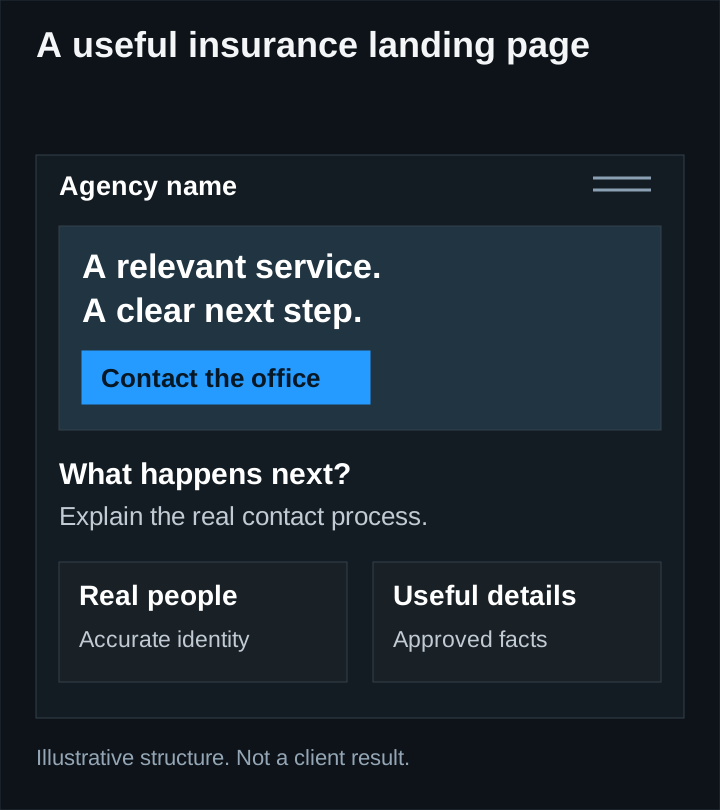
The opening should identify the agency, confirm the relevant service and show what the visitor can do next. Use a real logo and approved imagery. Keep the headline readable on a phone and the primary action easy to find.
A large image can give the page character, but it should support the message. Check whether text overlaps an important subject or becomes difficult to read against the background. Our real website examples show different ways to create a considered public design.
Do not fill the opening with every available navigation link, badge and product. Keep enough context for trust while making the intended journey clear. A link to agency information or relevant policies can be useful without competing equally with the main action.
Answer the questions that affect the decision
Below the opening, explain what the office helps with, who the service is for and what happens after contact. Include only accurate, approved claims. Show a real office or team when those images help a visitor understand who will respond.
| Visitor question | Useful page content |
|---|---|
| Am I in the right place? | Relevant service, actual agency and supported territory |
| What will happen if I submit? | A specific description of the next step |
| Can I call instead? | A working phone link and appropriate hours |
| Who receives this? | Clear office or team identity |
| Is this an instant quote? | An honest explanation of the form or external process |
Avoid inventing reviews or customer counts to fill a design component. If verified evidence is not available, use useful process information and real project or office details appropriate to the page.
Ask for what the next step actually needs
A general inquiry form should collect enough information for the office to respond and route the request. It should not become a full policy application simply because the software can support more fields.
Decide which fields are necessary, which are optional and which belong in a later approved conversation. Explain any required consent accurately. Do not bundle unrelated marketing permission into unclear wording.
Use visible labels, understandable errors and keyboard-operable controls. The W3C forms tutorial covers those fundamentals. Preserve entered answers when a recoverable error occurs, and reserve space for error text so the page does not jump unexpectedly.
Treat successful delivery as part of the design
A success animation is not proof that a lead arrived. The server should confirm a successful capture before telling the visitor the request was received. Test the intended inbox or system, retries, validation and a failure path with controlled test data.
Give the visitor a clear confirmation and an alternative contact route if appropriate. Prevent repeated button presses from creating unnecessary duplicate inquiries. Keep technical error details out of the public message while retaining enough internal information to investigate failures.
Phone measurement also needs care. A tap on a phone link is not proof of a connected conversation. The tracking guide explains how to distinguish interactions from reviewed business outcomes.
Review the page on a phone before buying traffic
Open the real page at a narrow width. Read the headline, use the menu if present, complete the form with a test identity and inspect the confirmation. Check image crops, text wrapping, loading behavior and the phone destination.
Then test the exact URL used in the ad, including allowed tracking parameters. Confirm that attribution does not leak contact details into analytics. If the page hands a visitor to another domain, verify the destination and document the limit of what your site can measure.
Improve the largest observed problem first. A confusing promise, broken form or unreadable mobile layout deserves attention before a button-color experiment. A strong landing page makes the agency's offer understandable and its contact process dependable; actual conversion performance still needs to be measured.